
A Majority of the web is made up of websites, applications, and Web Apps that rely heavily on the use of Google’s Material Design. To put it simply, Material Design is a design system created by Google to help teams of web and app developers build high-quality digital experiences for every platform, including Android, Flutter, iOS, and the web as a whole.
Before the inception and worldwide reception of Material Design, the web consisted of unfriendly user interfaces that were inconsistent in their design principles and implementation. Google’s Material Design was a response to the inconsistencies of the old web design principles. It was an attempt to usher the design world into a new era of design and user experience.
Gone are the days of inconsistent design principles that relied heavily on the web developer’s design methods and had little regard for the anticipated user experience. The creation of Material design pushed web design in the direction of simpler, cleaner, and user-anticipated web experiences that feel more responsive and intuitive.
The seismic shift in website design to accommodate the needs of smartphones led to the design revolution that birthed what we have today. Add the sudden surge of app development, and cleaner faster websites into the mix, and it becomes clear how much Google’s Material design changed the entire horizon for web developers and users.
Material Design was first launched in 2014, and this design system was based on a grid-based system. This design system was quickly adopted, and it did not take long before most websites on the internet began to use the new system.
While Google’s Material Design is now the holy grail of website and app development on the internet on several platforms, its journey to being the top design system was not always smooth. In this article, you will learn about the inception and adoption of Material Design, its subsequent changes, advantages and disadvantages, and its current use cases in the design world.
Material Design – What is it?
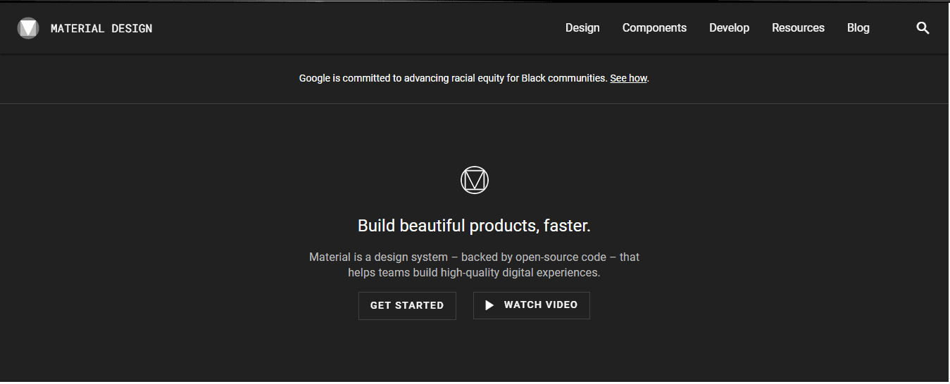
The material.io website contains most- if not all – of the components and guidelines required by a web designer to create stunning websites with the Material Design system.
Some of the website’s sections include:
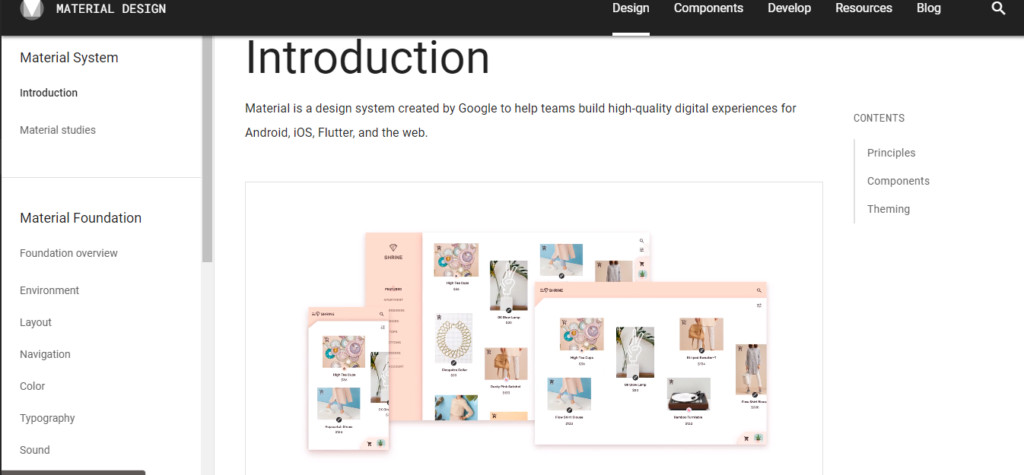
An Introductory section that explains the principles that birthed the design system and its purpose:
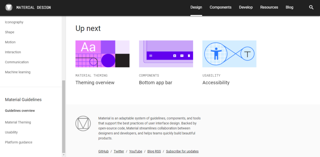
Instructional Guidelines that explain how the design system can be used to create beautiful and functional designs:
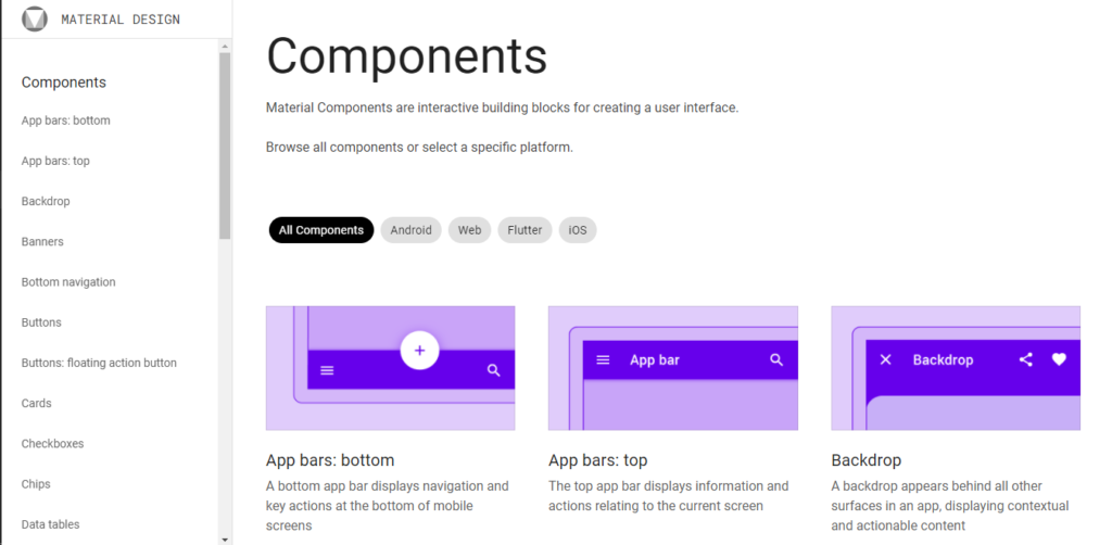
Lastly, there is a reusable component section for designs to experiment with Material Design, create their own from these components, and combine functionality with creativity:
The significant difference between Material Design and most of the other design systems that have been developed in the past and after it is its applicability. Material Design was not built for a particular brand or project. It was designed instead to serve as a design guideline for the entire internet.
Material Design was first developed for the development of Android apps. The goal was to have a design system that was intuitive to use and uniform across every device. Google eventually used Material design to rebuild all of its apps to make them more user-friendly and intuitive to use. Google Material was code-named “Quantum Paper,” and it comes as no surprise since it was designed using to mimic real-life materials with a flat disposition but with shadows and texture.
When Material Design was released in 2014, it did not take long before it became the standard design system used across both the android and the iOS platforms.
In a nutshell, Material Design can be described as a design system developed for the android platform by Google. It supports onscreen touch experiences in ways that employ user-anticipated touch gestures and animation that mimic objects in the real world. Material Design is the perfect blend of flat design techniques that promotes site efficiency and realistic lighting, animation, and effects to provide web designers with the perfect tool for optimized user experiences.
The Material Design System – Why does it work?
Over the years, since the development of the Google Material Design system, almost every platform in the world has adopted the design methods and applied a form of the design system in their design principles. The next question is, why does Material Design work so well? Since the entire internet has chosen Material Design as the holy grail of design systems, what are the things that make it unique and different from all the systems before it?
First, we need to discuss the design methods that existed before Material Design to understand what the new design system does differently.
Hence, enters SKEUOMORPHISM.
Skeuomorphism – a realistic design approach
Many would argue that Google’s Material Design was a reply to the old design-approach of application development, especially on the iOS – and they would be right.
Skeuomorphism became popular in the year 2010. The idea of skeuomorphism is to create UI elements that looked like the real-life versions of the objects they are based on. This design system was used for website backgrounds and icon designs.
Apple’s Homepage in 2012:
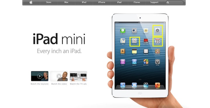
The principle behind skeuomorphism was to make users easily recognize and relate with since they looked like those in real life. Good examples include:
- The camera app looks like an actual camera on the home screen.
- The calendar app looks like an actual calendar.
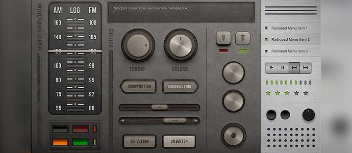
Here are some other examples of Skeuomorphic designs:
Radiopad’s touch user interface:
Folded Paper Friend interface:

Courtesy of Telepathy
While skeuomorphism was a delight to look at as it brought about the nostalgia of interacting with the objects on which the icons and webpages were based, it ended being too distracting for most users. And quite frankly, in some cases, it was just downright ugly to look at.
Also, skeuomorphic designs were not used for any other reason apart from being trendy as they offered no additional advantage in terms of efficiency and user experience.
It came as no surprise that flat Design became the successor to skeuomorphism. It took away all the excesses of skeuomorphism and brought speed and efficiency.
Flat Design – The beginning of a DESIGN revolution
No one that has used any modern device is oblivious to the ubiquitous presence of flat Design in almost every aspect of web design in modern times. The idea of Flat Design was to remove the excesses from skeuomorphism and still be able to represent objects in real life exactly the way they look.
Here is a snapshot of the transition of the new flat designs adopted by Apple for the iOS in 2020:
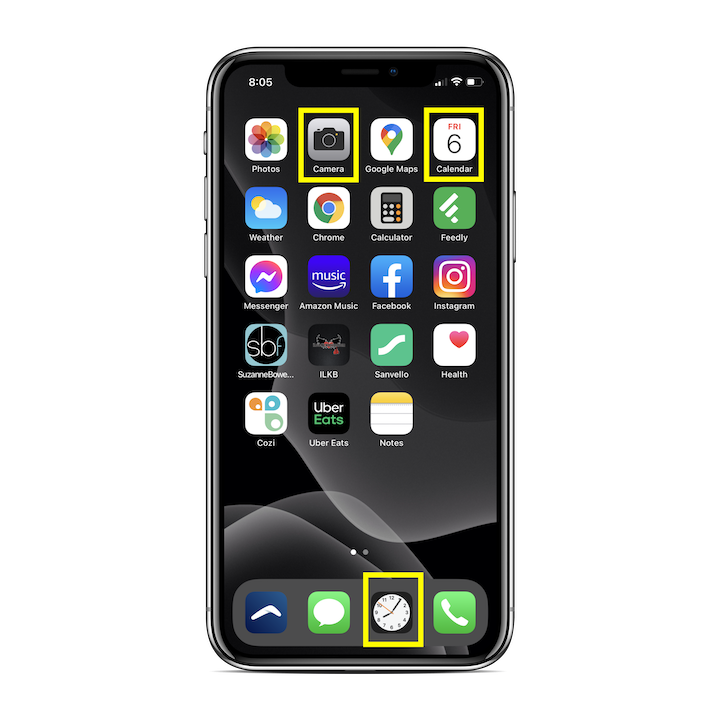 Courtesy of Elementor
The processing efficiency that flat icons offered skyrocketed their popularity among app designers and developers and made way for rapid worldwide adoption. The concept of flat Design was simple – take the most of the realistic qualities out of the old skeuomorphic designs and make them look flat.
Yes, it is exactly what you are thinking – flat Design is a direct subset of minimalism, which has unsurprisingly taken the technological world by storm. Designs that are clean, efficient, and functional just appeal to both developers and users. Flat Design was the perfect design system for the web. Or was it?
Unfortunately, flat Design had problems of its own. Flat Design presented the user with uncertainty – the uncertainty that comes with not knowing where to click and the lack of a sense of direction on touch interfaces. In summary, flat Design is awesome but it confused users a lot.
Hence, introducing MATERIAL DESIGN.
Material Design – The DESIGN revolution is here
To put it simply, Material Design combined the best components of the skeuomorphism and Flat Design, and combined them into one, then made them even better.
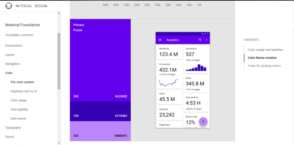
Material design, just like skeuomorphism, takes design inspiration from real-life objects but doesn’t copy them completely. Material design takes real-life aspects that give objects a sense of form and depth, like shadows, highlights, defined edges, color variations, and more to build digital forms. Therefore, Material Design relies heavily on flat designs, but the elements are allowed to behave like paper would in real life with minimal details.
This extra element of form and depth allows developers and designers to design apps and websites that respond more naturally to users’ intuition and have predictable touch patterns. Users can easily tell the parts of a Material design UI that is interactive and static just by looking at it.
An example of material design elements featuring color variations, shadows, and round edges:
Material Design, therefore, while not perfect, has solved many of the problems found in skeuomorphism and flat Design by combining the best aspects of both design systems and improving upon them.
Google went further to develop core design principles for Material Design and customizable Material design systems that ensure that the principles of the system do not stifle the designer’s creativity.
Material Design is the most used design system on the entire internet, and it looks like it can only get better from here.
You can visit the Material.io website to learn more about Material Design’s components, experiment with some of the established design components, and come up with new ones using the open-source API provided by Google.
Looking for a web design company? Contact 1Brand Design today for a free quote!
